

Color trends of Summer 2021
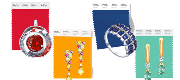
The authority of the color research industry, the Pantone Institute, annually provides a forecast that will color the new fashion season.
In December, analysts surprised us with the favorites of 2021: the leading tones were bright on the illuminating yellow and restrained gray. Experts explained the duo to the impact of global processes: post-pandemic sentiment requires “enlightening” hope and “thorough” resilience.
In summer, they provide universal freedom – in clothing, accessories, also in thoughts. Our reflections on the world around us are called to reflect the brightest, but at the same time natural tones.
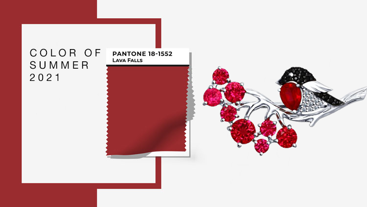
PANTONE 18-1552 LAVA FALLS
This volcanic color, which radiates the powerful energy that suffocated in the “dormant” year 2020, crowns its superiority and evokes vivid emotions rather than online emoticons.
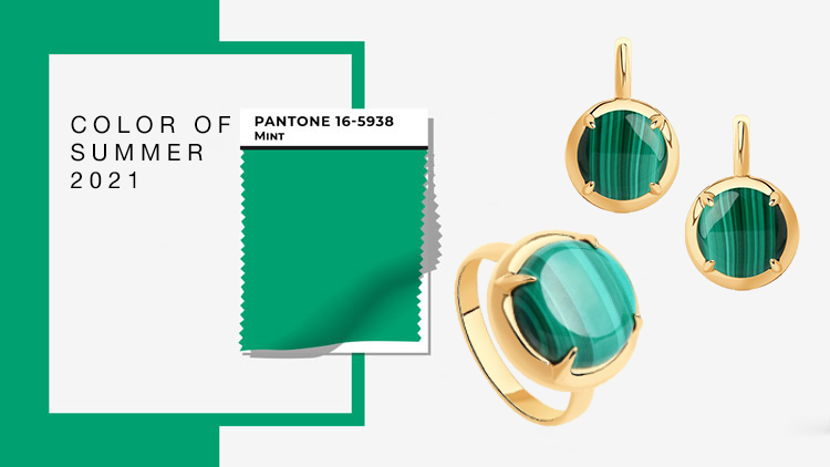
PANTONE 16-5938 MINT
There is no Pantone palette that can do without the green shade. This color is on the world’s agenda: eco and bio have become the religion of the new business giants. That is why clothes, interiors, and social networks are painted in green shades of moss and leaf tops, reminiscent of the breath of nature.
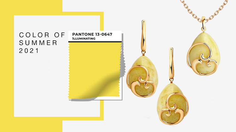
PANTONE 13-0647 ILLUMINATING
Hello, optimist! Yellow lovers vote for a bright future, inspiring hope that is no worse than the sudden rays of the sun on a cloudy day. Yellow will make you smile even for those who have completely forgotten about this simple function for a while. Find the courage to walk in inspiring colors – and there, the title of new leader is guaranteed!☺
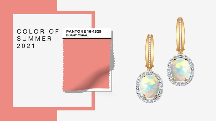
PANTONE 16-1529 BURNT CORAL
Corals in different shades meet us for the third spring in a row – Living Coral 2019, Coral Pink 2020 and the new favorite Burnt Coral of 2021. This autocracy, which replaces the color pink, can be explained by the need for friendliness and tenderness. Still very solemn and modernly aristocratic.
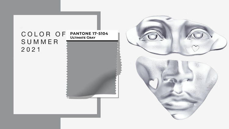
PANTONE 17-5104 ULTIMATE GRAY
Since meditative gray is a paradoxically successful duo with a vital yellow color, it does not have to prove that it will definitely fit in with the rest of your wardrobe and mood palette. A very solid foundation on which the world rests; it promises to find a basis and inspire hope for the desired stability.
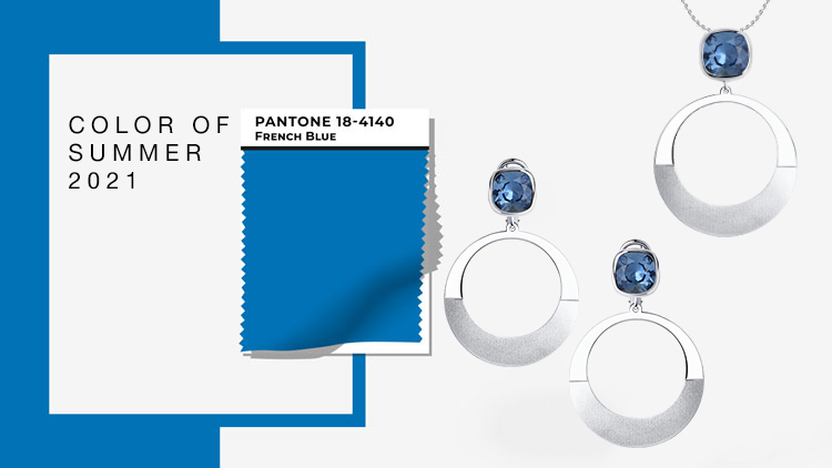
PANTONE 18-4140 FRENCH BLUE
The practical part seems to be in the must-have palette of each season. A little romance and French blue take us across the clear sky to the Eiffel Tower and the artistic landscapes of the Seine. Sailing in the blue waters of the Mediterranean has never been more desirable.
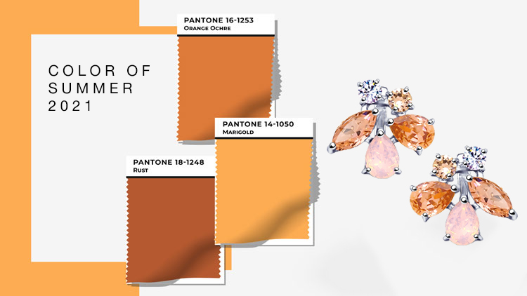
PANTONE 16-1253 ORANGE OCHRE
Pantone palettes have three shades of orange, but if the shades of ocher and rust gravitate more to autumn, calendula is a greeting from summer. This color symbolizes the love of life. The golden orange acts as a portable battery: it charges your energy when the sun has disappeared behind the clouds in the sky.
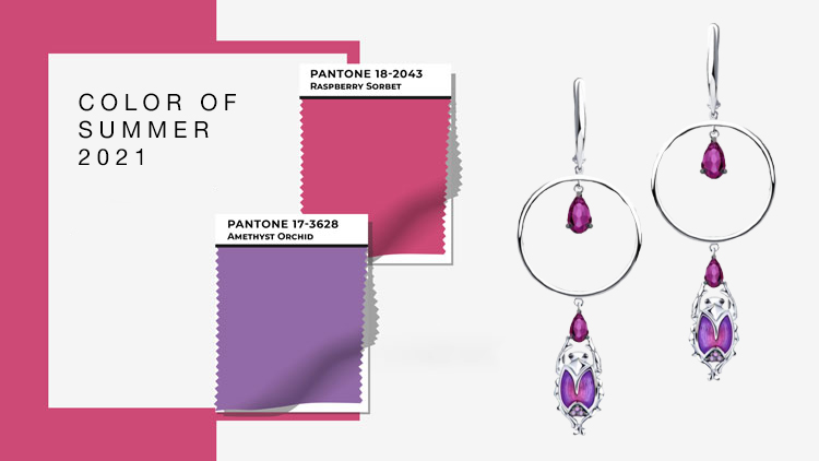
PANTONE 17-3628 AMETHYST ORCHID
PANTONE 18-2043 RASPBERRY SORBET
Spring is the best time to get flowers and compliments, while summer is perfect for all sorts of juicy sorbets. We adorn ourselves with an exotic orchid shade of amethyst and succumb to the tempting raspberry sorbert temptation without much regret about calories. We are sure – the best parties are on the way!
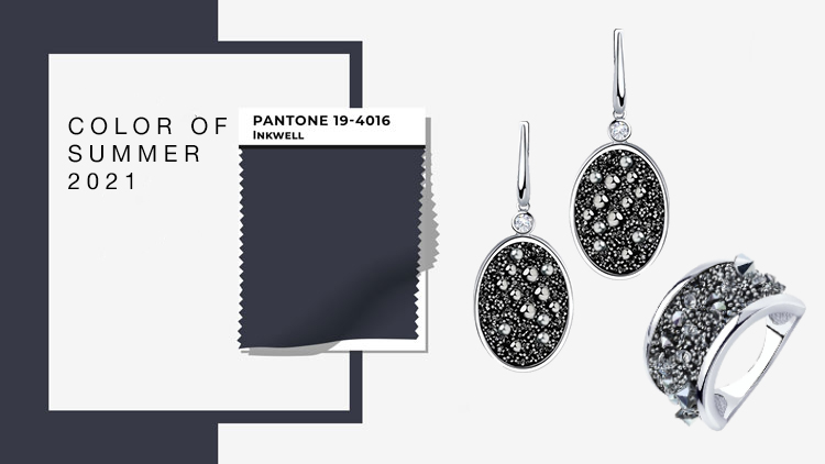
PANTONE 19-4016 DARK GREY
Just as your favorite scent has a particularly intense version, blue has a different, darker side. Effect of spilled ink on white sheet – blue color is almost impossible to see at this thickness. Stoically restrained, conscientious and noble, dark gray announces that we also need practical shades in the spring. And we nod in agreement: minimalism has its own charm.
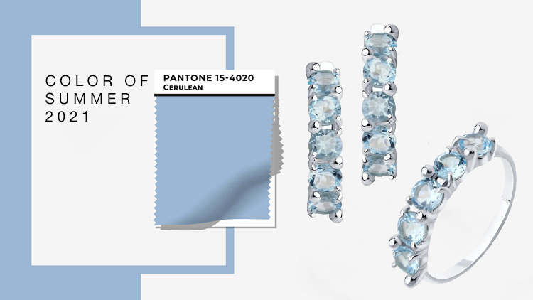
PANTONE 15-4020 CERULEAN
Crystal clear, fresh, refreshing, just like the summer wind. The promise of quick happiness and a smile for no reason, the “new” blue color gives self-confidence and motivation to be better, faster, stronger.
How many minutes are left until your personal summer? 😍